Joyclean
Web Design Redesign, Illustrations, Prototyping
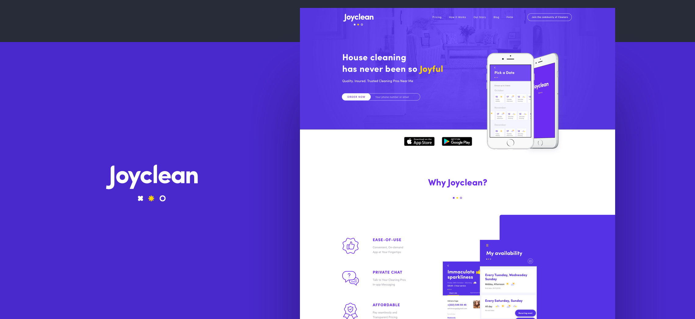
Along with Flying Saucer Studio, I worked with Joyclean on their website redesigning their entire interface.
The Client
Joyclean is a cleaning services company based in the US, we were working with them for a long time in their Visual Identity/Branding and their App Design. They came this time requesting a new web design totally based on their fresh new identity we created so user get more comfortable requesting services out of a great User Experience.
Something important to say here is that JoyClean involves 2 type of users; Companies or individuals who give the services and the clients so one of our main goals was to show relevant information about the product to both users.
Requirement
As usual, I got all the requirements needed for this project in a call with my Manager, Adrien Colombie, we discussed all the important information about starting from the objectives of the web design to who is gonna be the copywriter involved in the project. I take the chance to ask for important questions about the project; Do you have statistics for the current website they are using? Main objectives? Any inspiration or website the client has as an inspiration?
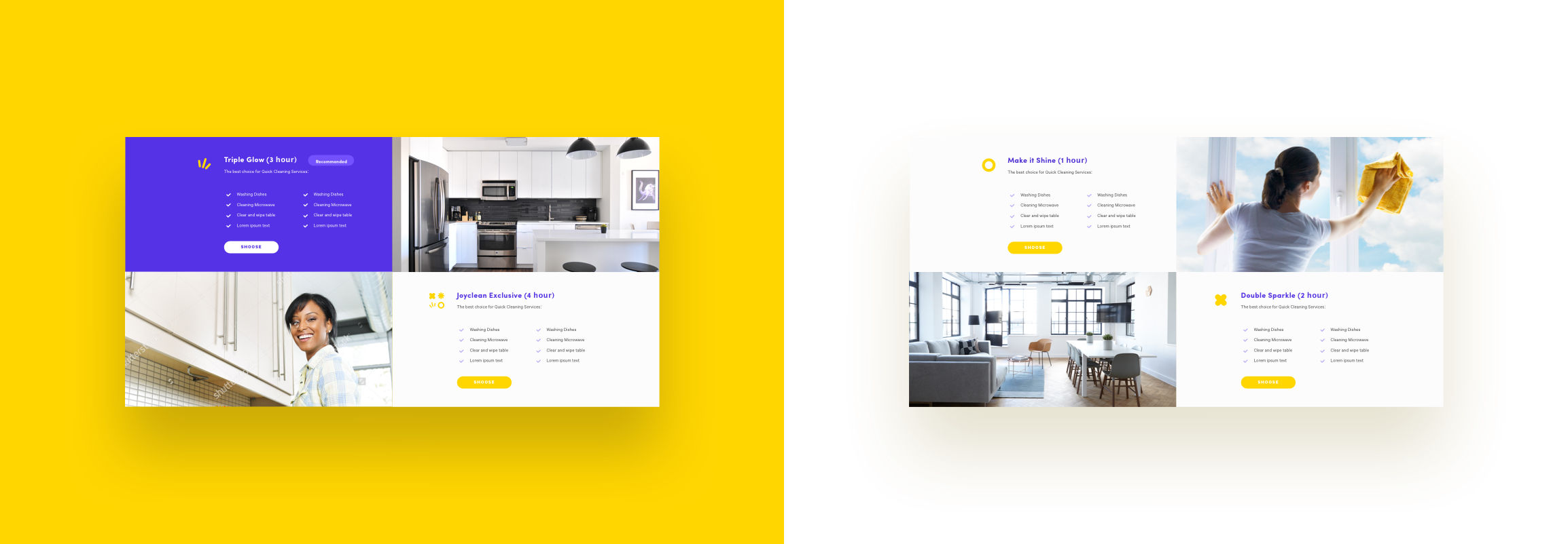
- We needed to change structure or Layout
- Enhance the interface Design
- Use a better Hierarchy
- Balanced the type of client content direction
After getting answered all important questions answered and with all the content created by the copywriter in collaboration with Adrien Colombie I was then ready to start…
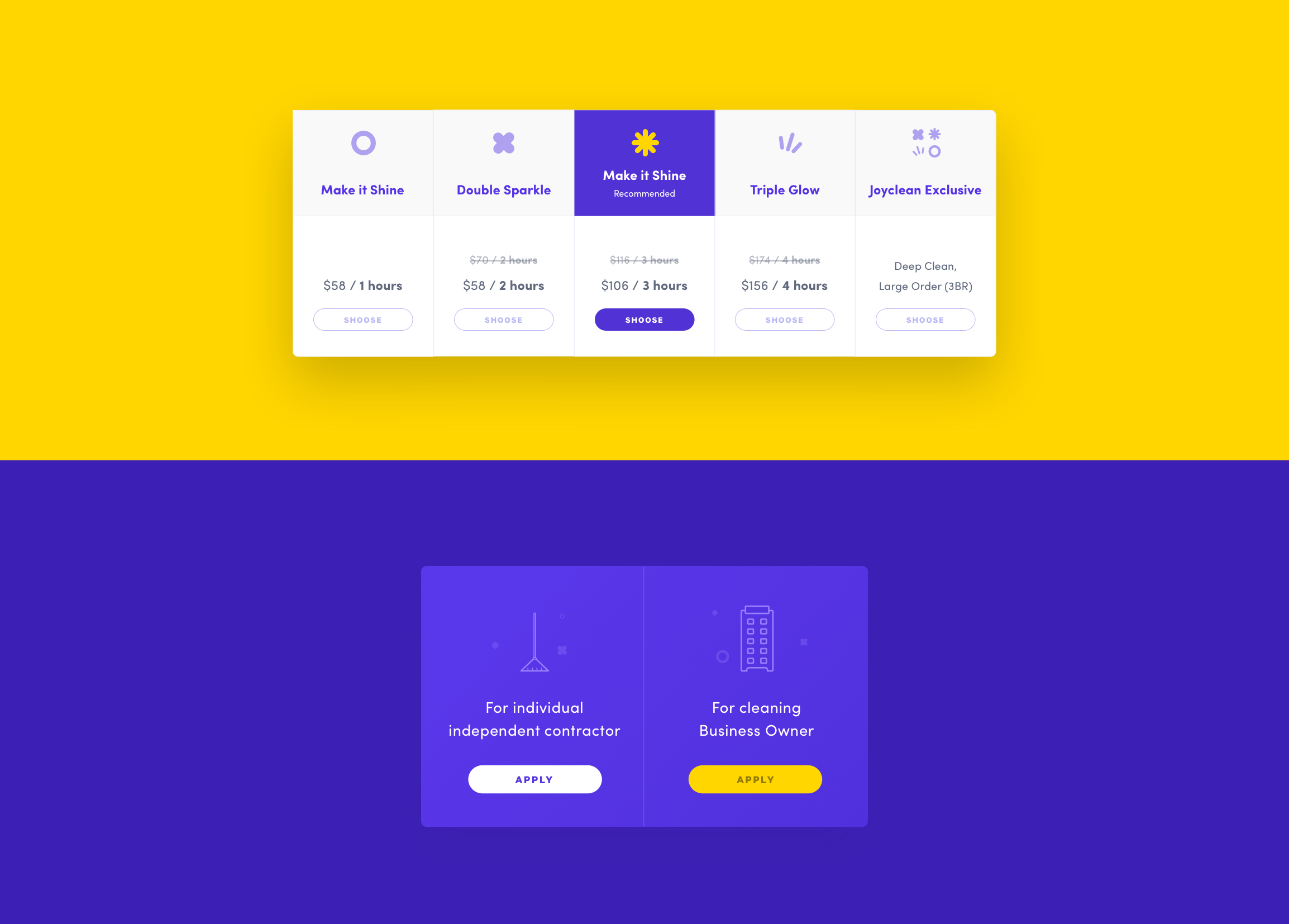
Designing patterns
To refresh my memory I dig around the JoyClean Website and researched as much as possible about the company and the experience the actual user were having with their current website and I was surprised with my findings, the users were not using their website, 10-20 users per month even though they were famous but seems like worth of mouth was taking effect since they were having constant revenue.
SEO was not working and also retention rate was on the floor because of the bad experience users were having on the website. I continue with the research process searching for inspiration I felt match perfectly what I wanted to convey, icon design, interfaces and even examples of the tone of voice so the copywriter had an idea.
With a collaborative approach we were able to mark down a great direction that makes me feel prepared to continuing creating the flows/navigation for the entire website and the first initial sketches delivered to my Manager on Invision even though they were rough, with feedback implemented, we went from initial sketches to more finalized wireframes adding features or improvements from step to step until we were satisfied with the results.
For faster feedback from my manager, I delivered versions of Initial Sketches, Lo-Fi Wireframes, and others into InVision Prototypes, it also enhanced a lot the iteration process of each version.
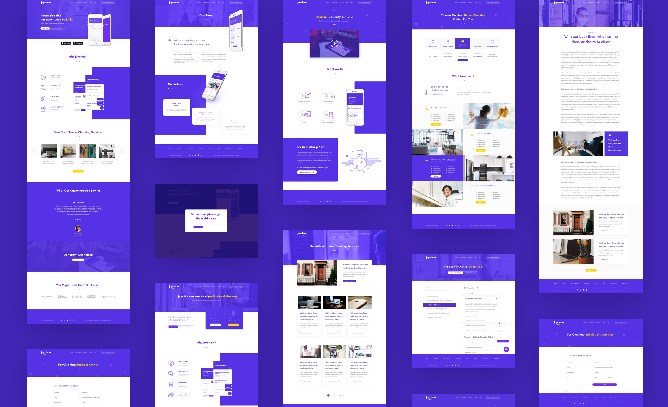
Design and Presentation
We wanted to convey cleanliness, so our designs were created based on that guideline, from moodboards to the final design. I took enough time to research inspirations for the different aspect of the project; Illustrations, Interfaces, patterns and interaction design.
I used Sketch to translate my Initial Sketches into High Fidelity Wireframes pushing the design and the patterns as much as possible and then I converted them into final muck ups presented to my team in an interactive prototype for feedback.
After the iterative process, the Development Team and the SEO Team got together to start coding and implementing strategies for better positioning on the Web.
Conclusions
We were able to deliver a fresh product with a better user experience and interface based on our results on testing with the real users for about 3 months. We made a comparative between the new and old one and the results were amazing.
- +130% more users getting into the page
- 40% Better Retention rate
- Better SEO Optimization
Of course those results, were completely based on a 3 months period, in a few months results were supposed to get better.
Definitely the SEO Team made a great job in term of getting people into the website. A great Design without a great SEO Strategy could be invisible in the big web.