OKUS
Dashboard, Web Design, App Design and more
Considering the essential need for students to receive a progressive education that aligns with the rapid advancements in technology, the development of Okus aims to offer a superior learning experience.
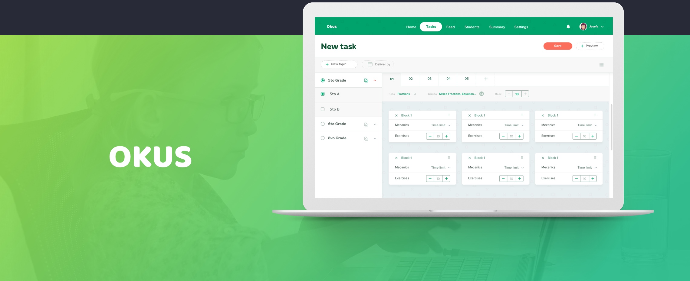
The Client
Introducing Okus, an innovative startup from the Dominican Republic, acclaimed as the year’s most impactful by TOTAL and esteemed Japanese institutions. Co-Founders Manuel and Andres, mathematicians with PhDs from the University of Utah, envisioned enhancing education in their country.
Their motto, “Technology advances fast, so must education,” drove them to create a cutting-edge platform for children to learn on their favorite devices—tablets, smartphones, or computers.
Backed by the Dominican Government, the app is currently being piloted in four colleges, with plans for nationwide expansion. Okus’ ambitious project is shaping the future of education in the Dominican Republic, making learning more accessible and engaging.
The Problem
The Dominican Republic’s education system faces challenges, and while some studies have shed light on areas for improvement, it’s essential to focus on the positive steps being taken to enhance the learning experience.
To engage students and improve retention rates, educators are embracing innovative and interactive teaching methods, making learning enjoyable and captivating. Efforts are underway to provide better resources and support for teachers, creating dynamic and stimulating classrooms. By prioritizing student-centered learning and investing in professional development, the country aims to transform its educational landscape positively, empowering future generations for success.
Solution
Okus is a cutting-edge multi-device application that transforms the learning experience for students, teachers, and parents. Our goal is to position the Dominican Republic among the top companies in PISA results, leading to improved quality of life, reduced criminality rates, and better education.
With Okus, students can complete homework, access examples, utilize a digital tutor, and play educational games. Teachers benefit from efficient task assignment and progress review, along with a wealth of interactive content to enhance their lessons. Join us on this transformative journey towards a brighter future.
Setting the Scope
I had the pleasure of meeting Andres and Manuel to engage in a comprehensive discussion about our exciting project. Our conversation covered various essential topics, including the company’s objectives, an overview of the project, the research they had already conducted, and a glimpse of their initial wireframes, thoughtfully created in Microsoft Word. This allowed me to grasp a clear understanding of their vision. Moreover, they were generous enough to share some features they envisioned for the app.
In my pursuit of gathering extensive information and details, I probed them with pertinent questions:
- What is our target audience?
- Which devices will the app be primarily used on?
- Do you have any particular inspirations in mind for the design and functionality?
- Have you identified any direct competitors for the app?
After several productive meetings with the team, we enthusiastically commenced work on this ambitious project. We initiated with substantial design and user research efforts to fully comprehend the students’ needs and preferences.
Additionally, we recognized the significance of analyzing our competitors. We aimed to learn from their positive aspects while being cautious about potential pitfalls in terms of user interface (UI), user experience (UX), and administrative functionalities. This enabled us to establish a solid foundation for our development process.
By adopting a meticulous and well-informed approach, we are confident in delivering an exceptional app that will meet and exceed expectations.
Patterns and Requirements
Intuitive, Education, Playful
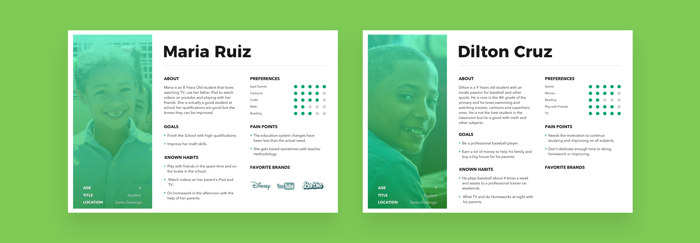
With those 3 words in mind I started making a big Design Research and putting pieces together into 2 mood boards with different design directions but same message to be presented to the client, so they can make decision between witch one they like the most. I make myself secure that not matter what’s their option the results were going to be the same. I put my User Research findings into a some Personas to have information more accessible when Designing.
After having clear the direction to take, based on my user research findings I started creating my requirements, what exactly the users are going to be able to do in the app. To organize my user requirements I divided in 3 documents as I was working for 3 types of users; Students, Teachers and Parents. I then categorized each requirement to make the document structure/organization a lot better.
Example:
Tasks
- Create and Assign Tasks
- Add Additional links
- Task Historial
- And others
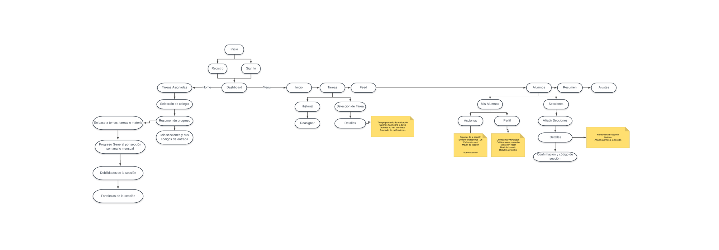
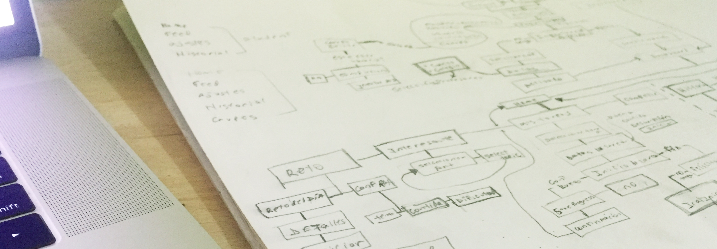
With all my requirements ready, I then started to create the users flows of the entire project. To make things easier for me, I divided them by user and start crafting on OmniGraph the draw, thinking about each type of user so complexity is proper for each kind of mentality.
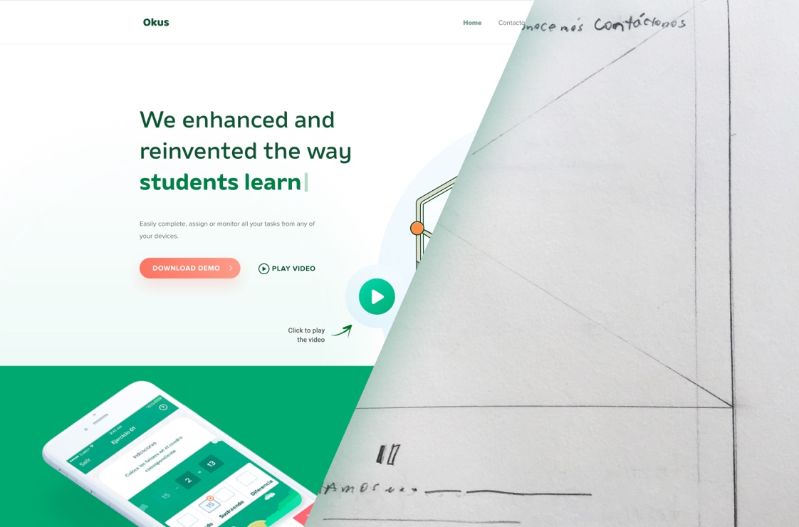
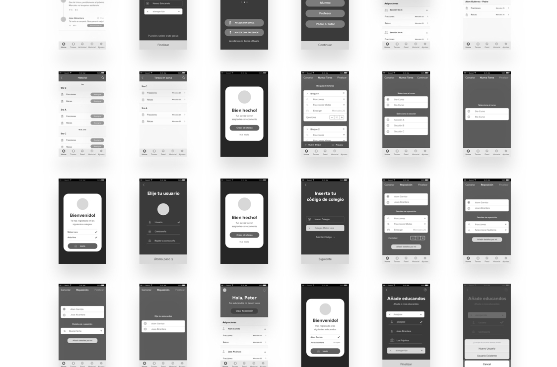
I spend a couple of days working on Low Fidelity Wireframes and the iteration process on my favorite prototyping app, InVision and then start the conversion into High Fidelity Wireframes making it better from step to step.
Design
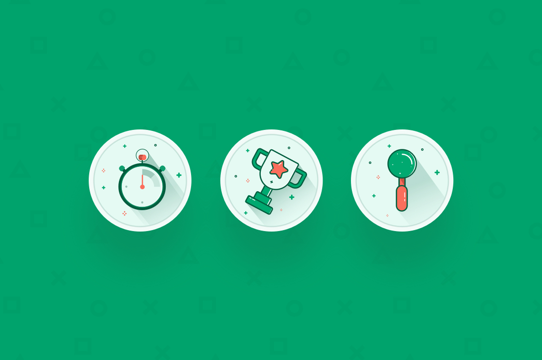
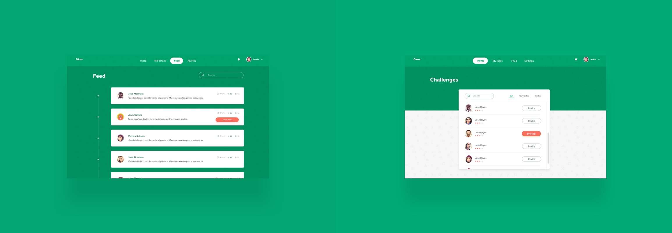
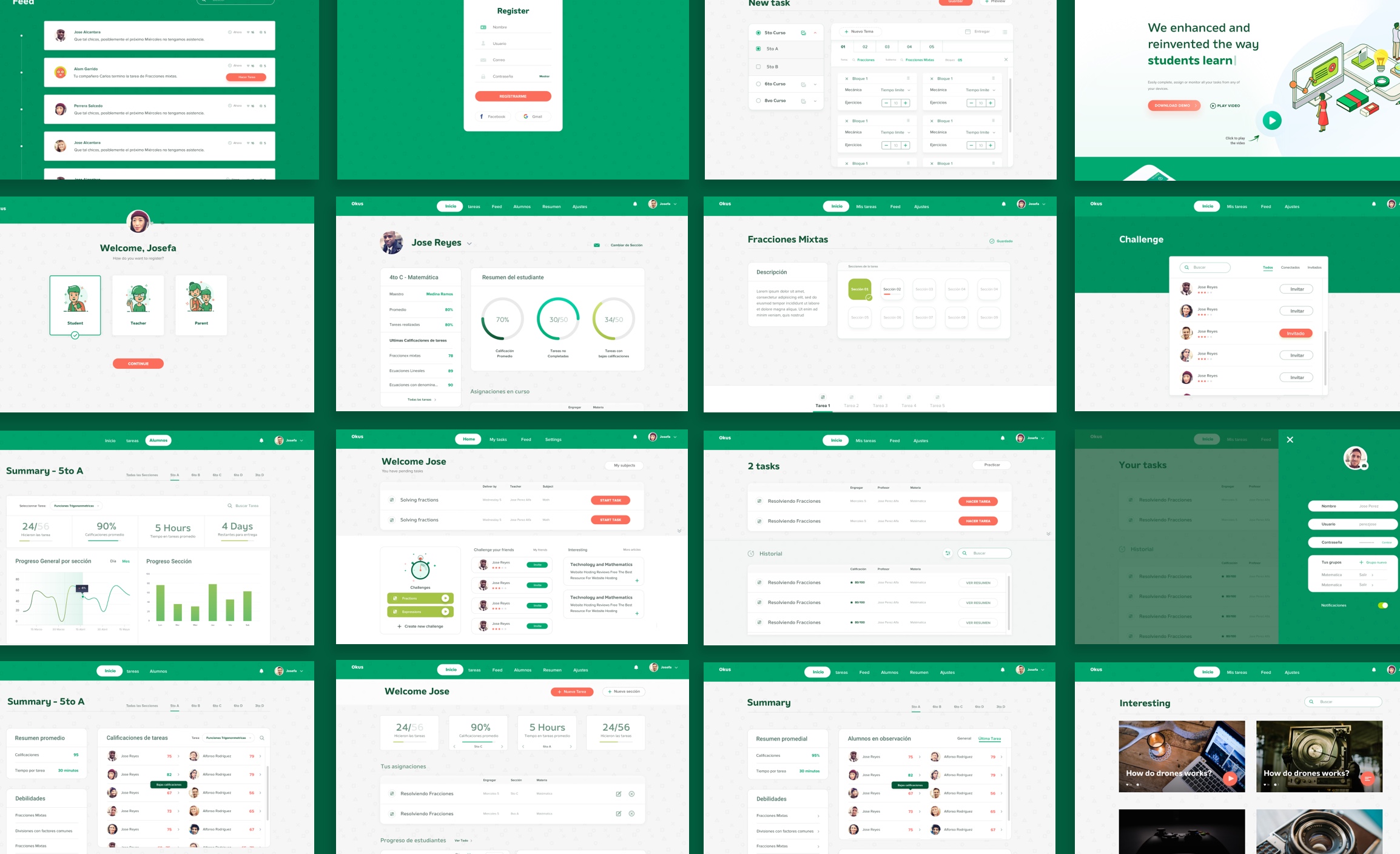
Color/imagery/styling. After all the iterations of my HFW, I was ready to start working on the pixel perfect version, adding colors, images and whatever needs to give the look and feel of a finished product. Mockups for a better presentation and a couple of days more iterating to fix errors in the UX/Flows as well as adding some better details/patterns to our final design.
Testing
Along with the developer we were ready then to start testing our prototype with the end users asking them to perform differents actions while we were analyzing closely how easy and how fast they were able to perform those actions, what problems comes into the process of performing an action.
Results:
- Some of the task solutions we provided were sometimes kind of difficult to understand for children.
- Students got confused about passing to the next task by sliding left
- They did not know in what stage of the task they were at, there was not an indicator
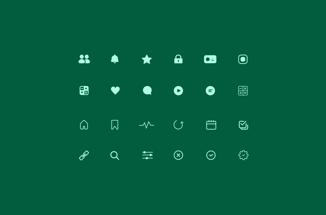
- Labels were needed in some of the icons
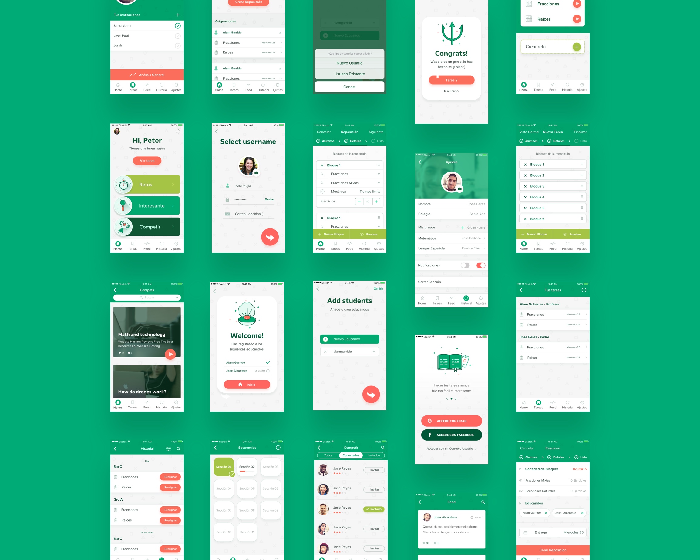
After that section of testing, we start working on solutions to make the app as intuitive and easy to use as possible. We added key visuals to some of the tasks, added some indicators of in what step they are at, something like breadcrumbs, added labels to some of the icons for a better and faster understanding.
Conclusion
Working in the Education industry is a really fulfilling experience, I was able to create a great app from a Visual and UX perspective based on the Students Feedback and the help of the whole team, developers and designers. Working for kids is a really fun but at the same time challenging thing, since you need to think as minimal and simple as they do witch is difficult when you dig around with complicated flows and thinking processes.
In the end, we deliver to the Education industry an application that:
- Enhance the students learning process
- Create better student management and qualification way
- Put on the loop patents so they can monitor their students
- And a lot more!