Everthing Benefits
Dashboard Design, Icon Design and more,
They came asking for a redesign of their existing platform based on the idea their actual design lacked structure, good organization, use of colors and hierarchy between elements.
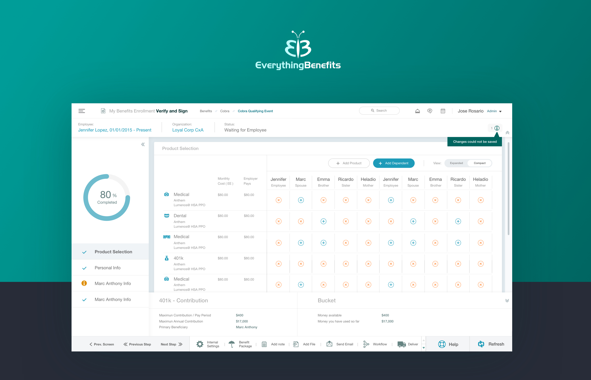
EverythingBenefits is a leading provider of next-generation, end-to-end benefits management solutions and services that help businesses of all sizes and their employees experience benefits in more meaningful ways.


My conclusion about the old design; Poor structure: This design lacks great structure mostly because of a bad use of the grid. Negative Space: There is a cleared bad use of white space. Bad Alignment: There are a lot of errors of alignment witch make the design feel less professional. No harmony: It is difficult to focus on a specific area cause the colors are disorganized and without hierarchy. Bad Hierarchy: It is difficult to determine the main actions and the most important sections of the layout and finally Icons are Old-Fashioned.
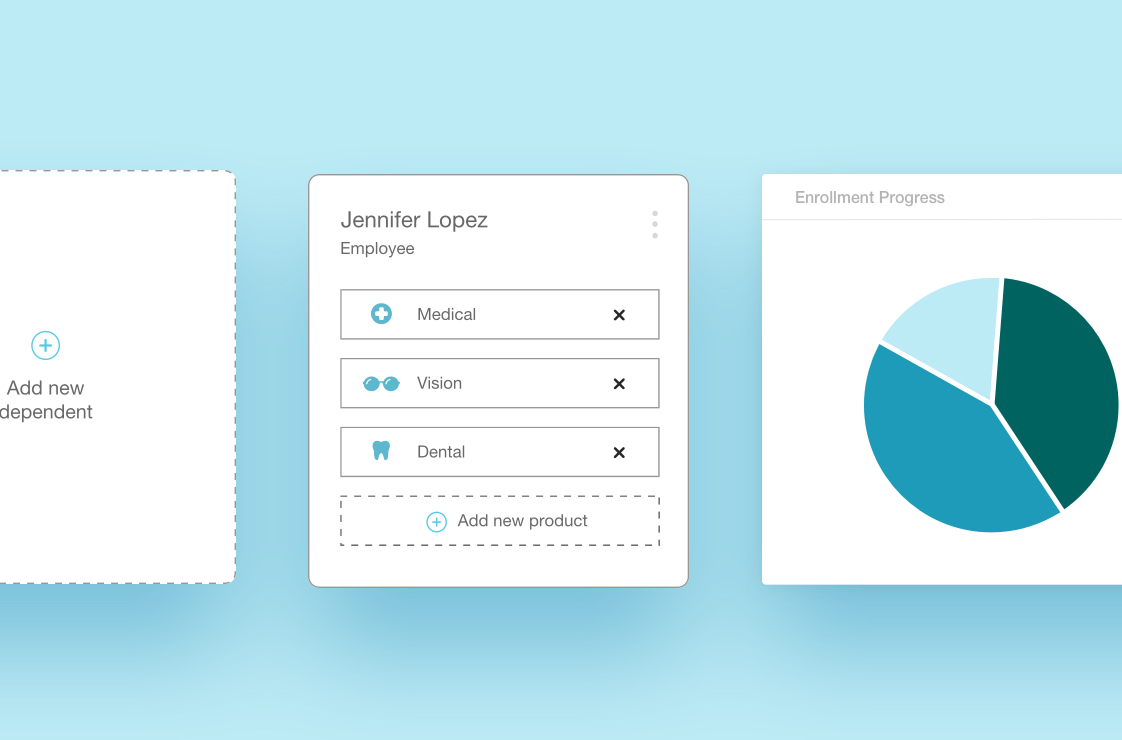

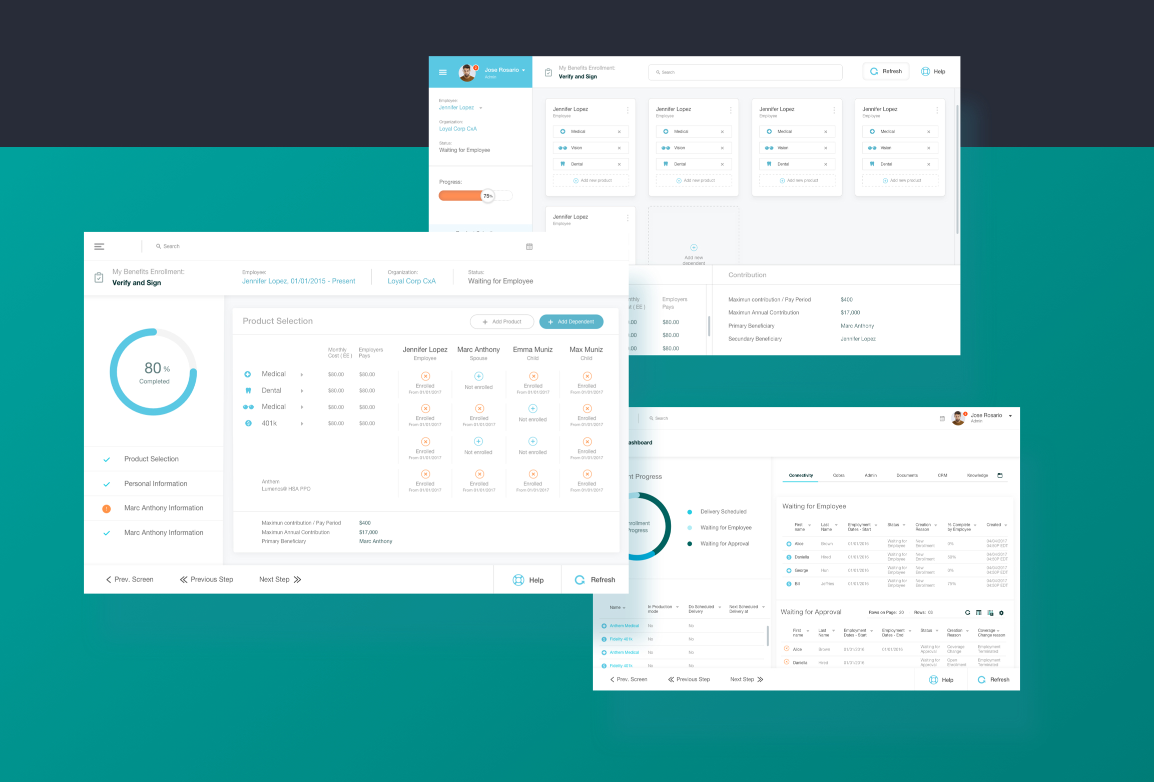
Redesign Goals: Create a better hierarchy between elements, create a modern and Clean Dashboard, enhance Usability and Make it appealing.
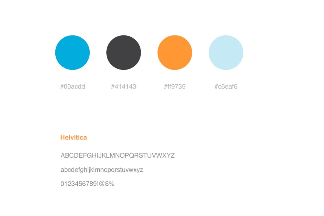
After Analyzing in detail the old design I created a mood board with great references I liked, in order to be organized in the direction I was about to take. Taking the actual design as the wireframes the next step was to organize the style guide, shared styles and then Start with the Pixel Perfect UI Design.
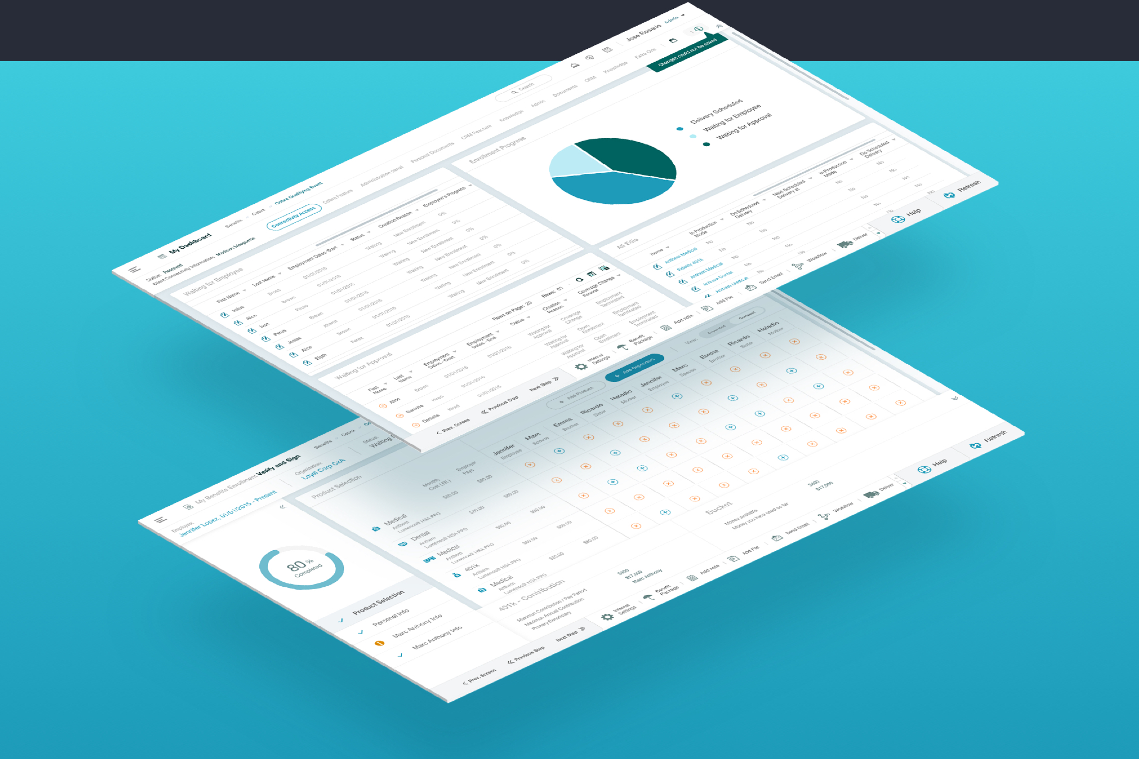
After having the Style Guide structured I started creating the Pixel Perfect UI taking the old design as wireframes.