Qmarket
Web Design, Illustartions, Icon Design and animation
The client wanted to redesign their entire Web interface with a robust and interesting style that reflects professionalism and trust.
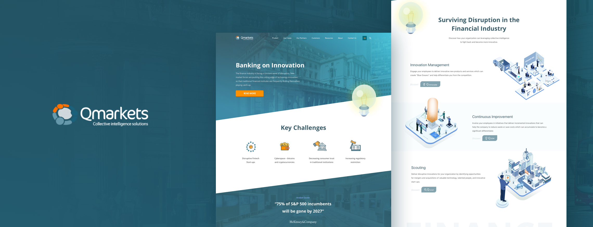
Working with this client was a really big challenge. It really pushed me to give more and more. Qmarket is a Fintech company based on Granada that helps people and companies with their finance stuff. They realized their website was old fashion, too many colors, lacks of organization and structure, so they decided to ask for a nice new Design for their online identity. Based on the fact the client wanted to build trust I started working on a nice and bold Design.
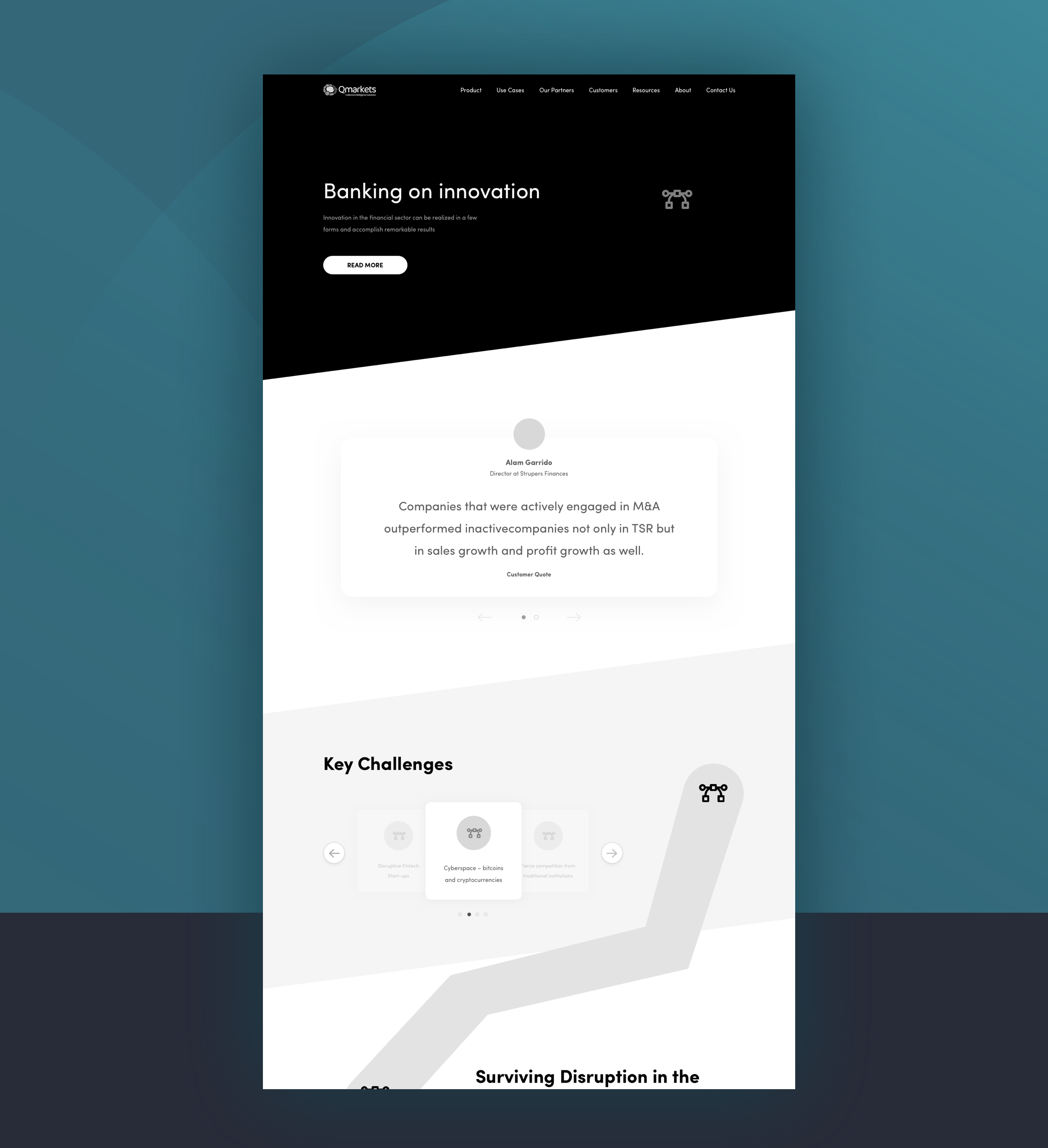
After some meetings to check if the idea behind the project was caught I start with the first stage; Research. Looking at some nice references to show what is my design perception and design direction recommendation. Finding inspiration was a time-consuming stage since the client had a specific idea on their mind. So, for example, when I showed them 2D references they decided on 3D or Isometric Illustrations. Then after the client was happy with the direction I then started working based on the Existing User Flows and even taking the online Web as a reference on my Wireframes; Low and High fidelity wireframes taking into consideration a 12 Column grid.
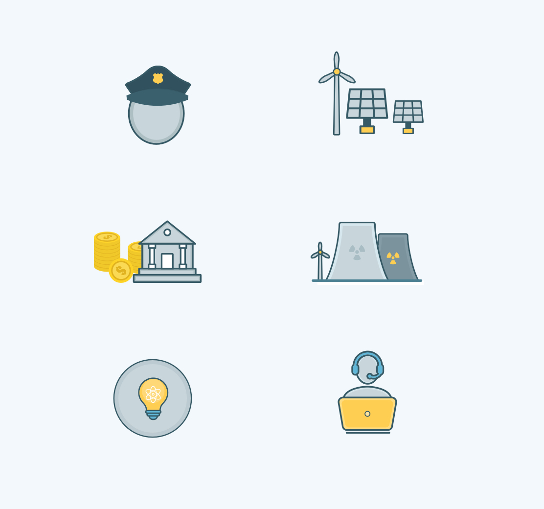
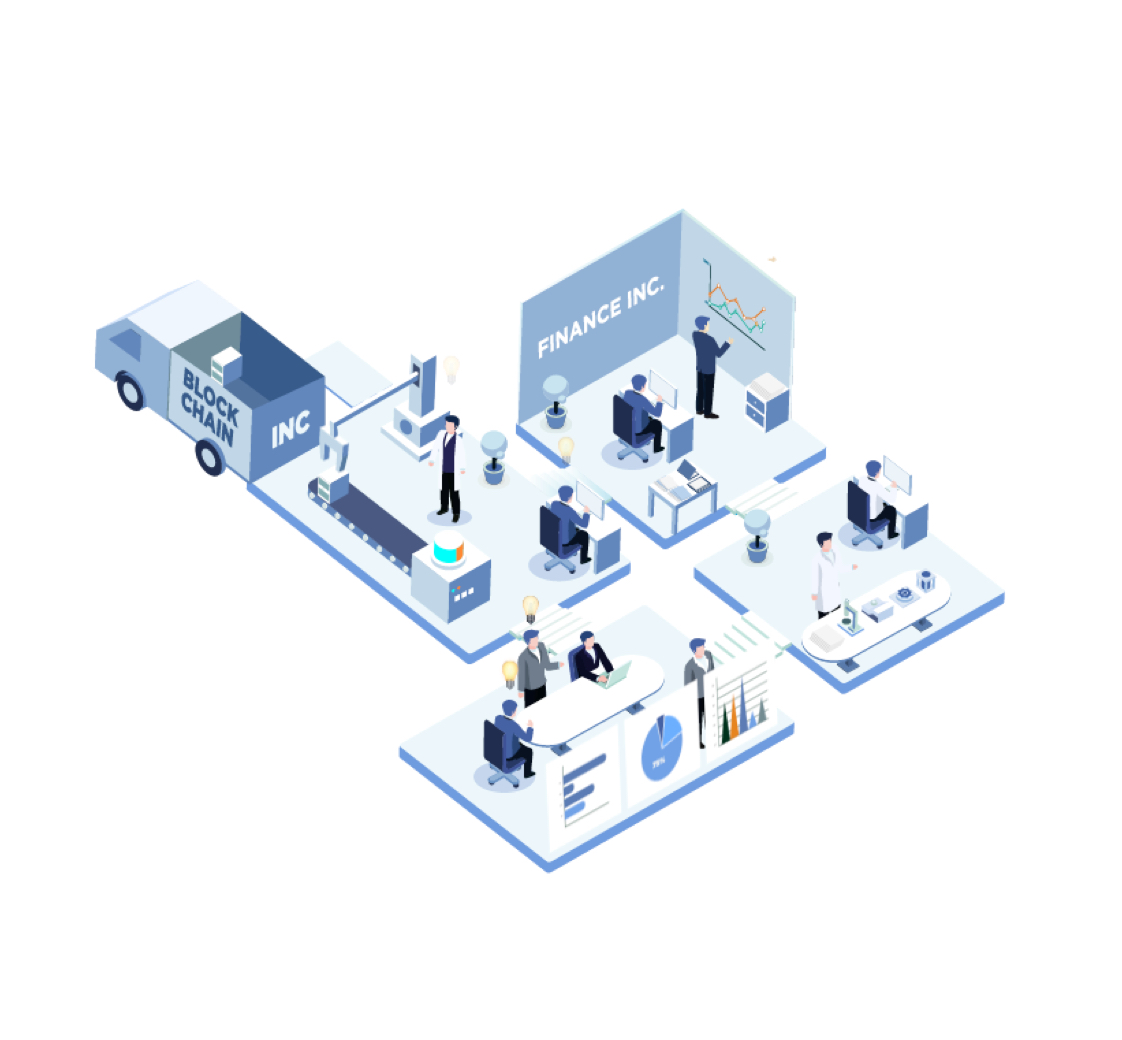


I received feedback about 5 times. Now you understand why I said it was a challenging project, the client was kind of difficult, to be honest. After a couple of iterations, the client final approved the initial stage and then we were ready to continue working on the Design step.
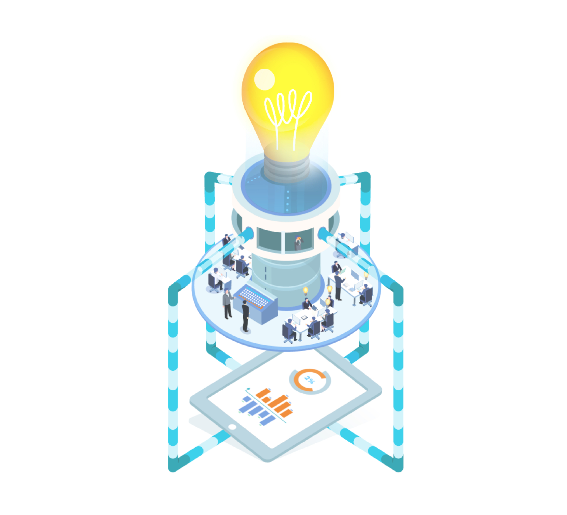
A couple of mockups were delivered for a better presentation and a couple of feedbacks were addressed after the design step to then mark it as done. Icons, patterns, imagery were added before creating the big/isometric illustrations that took me days to then been then ready to animate them.
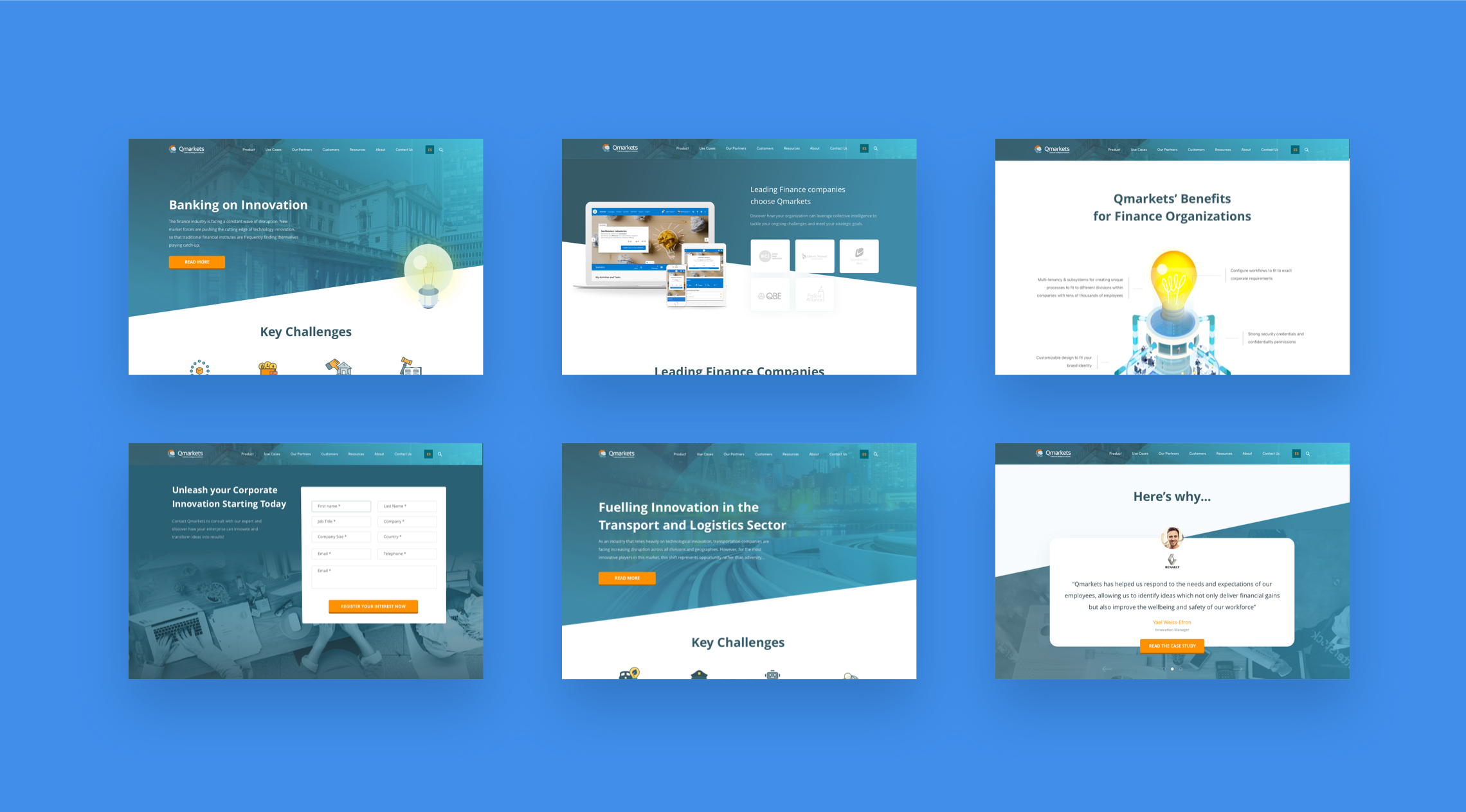
After all the illustrations were properly animated, the design was ready with the feedback/corrections addressed and the content was properly corrected we were ready to send the design from Sketch to Zeplin so the developer has it easy to start working on the FrontEnd.