Vital Vio
Web Design, Icon Design
Vital Vio wanted a complete redesign of their previews web with a cleanliness concept in mind, conservative and with tons of white spacing.
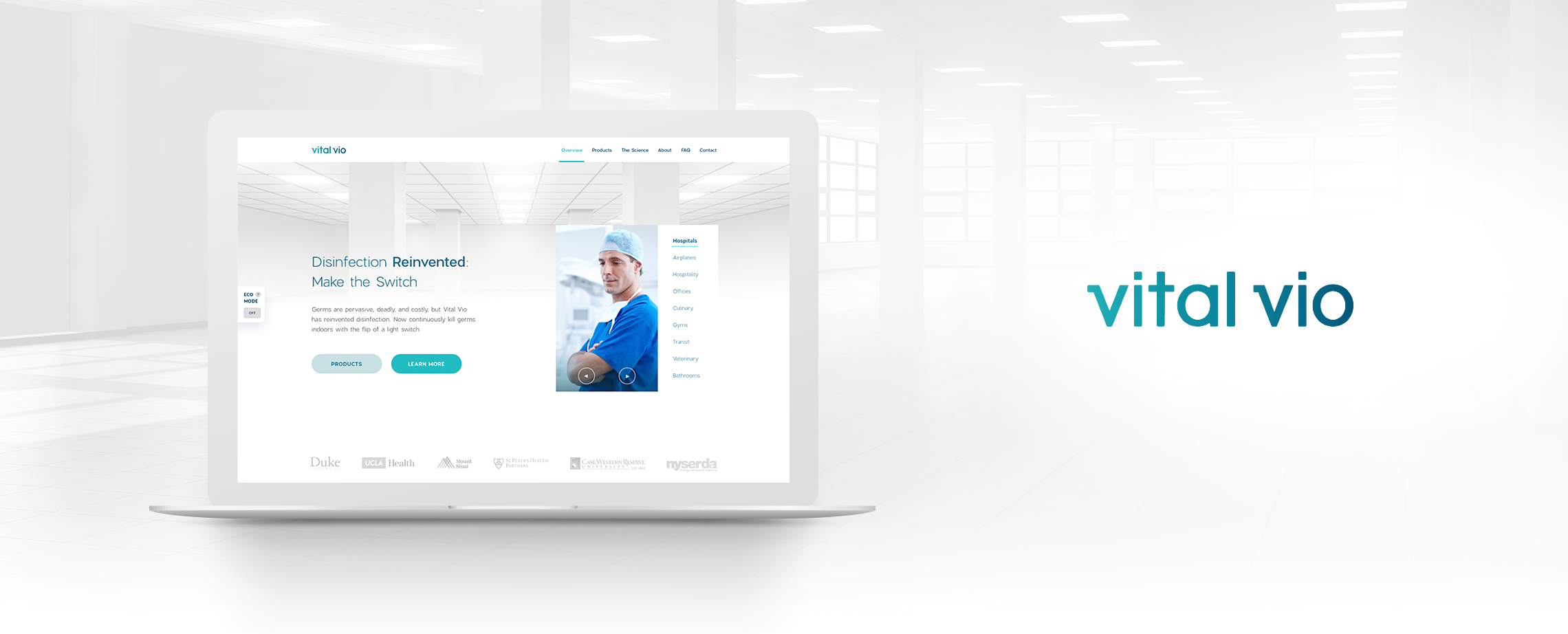
Vital Vio is one of the top level companies working on light products. Their success is based on the fact that their products can illuminate and disinfect at the same time, but their website was not so sexy. The client wanted the same content, the same concept, and the same identity so I just collected their identity and start analyzing their old website.

My conclusions about the old design were: There was not a clear message in the hero, a CTA in the Hero is needed to increase the conversion rate, bad use of white space between elements and line height, Icons are not attractive and In need of a modern UI Design.
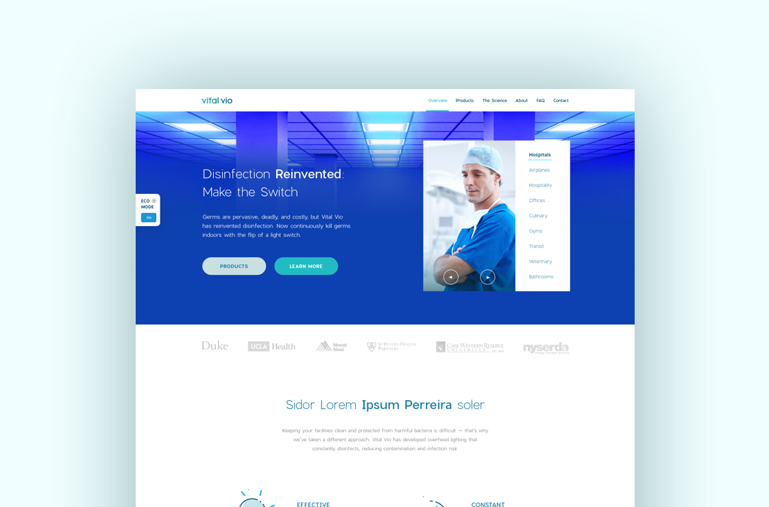
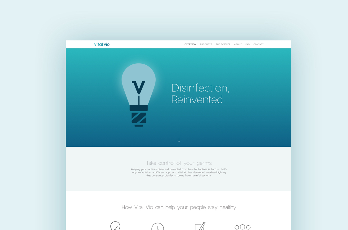
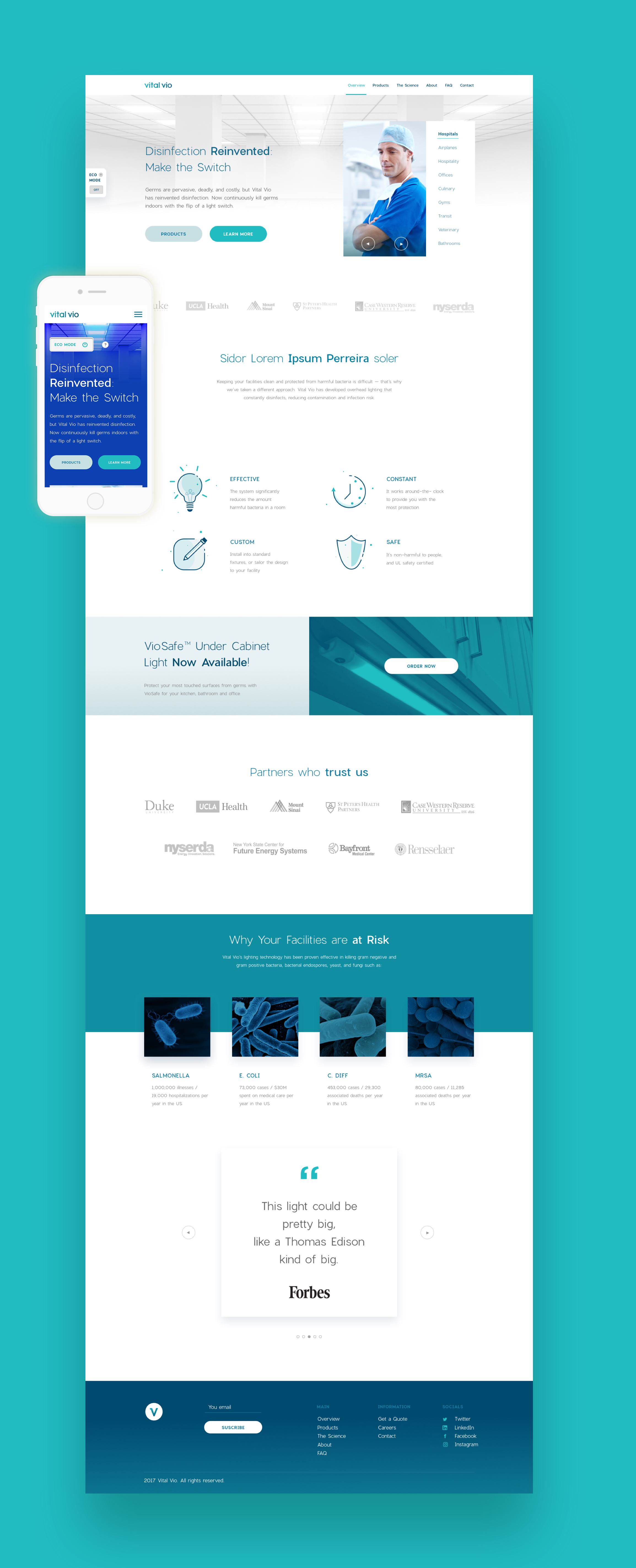
After a huge analysis, I started making a design exploration by building a mood board with great web references I liked, then I started designing taking their old design as Wireframes and also using their existing visual identity.
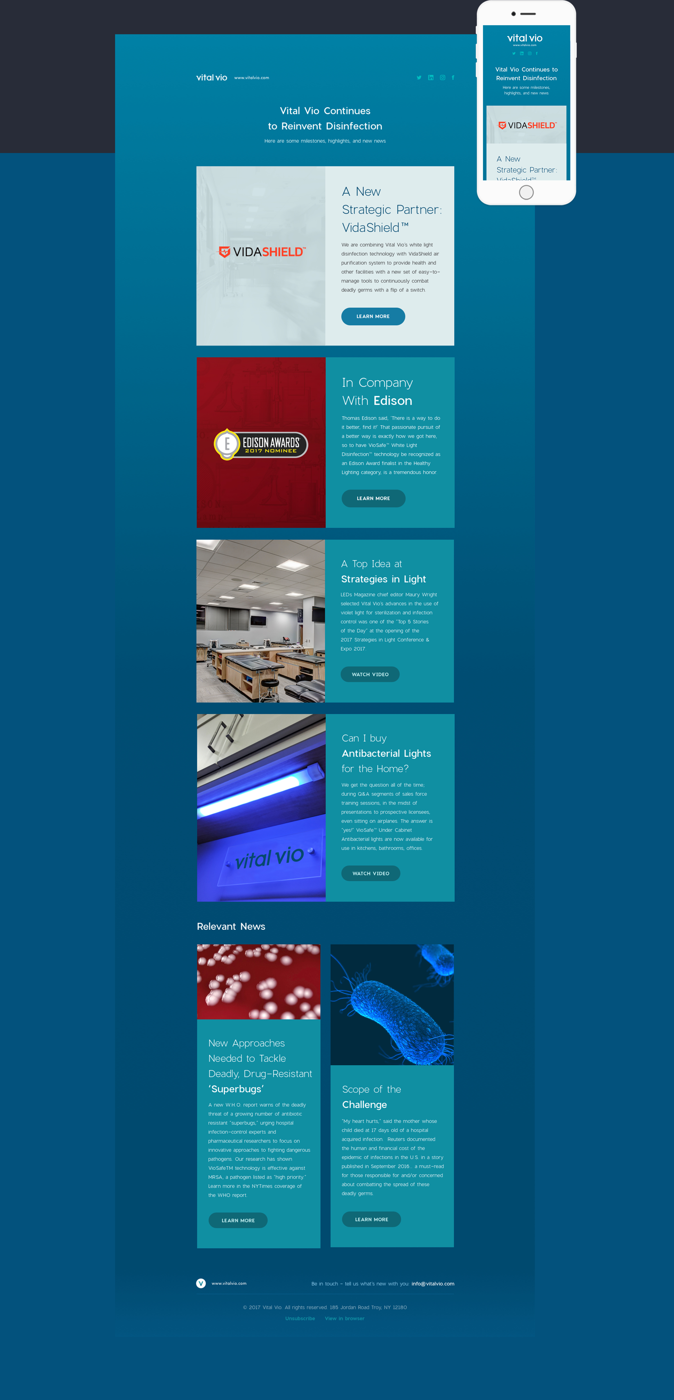




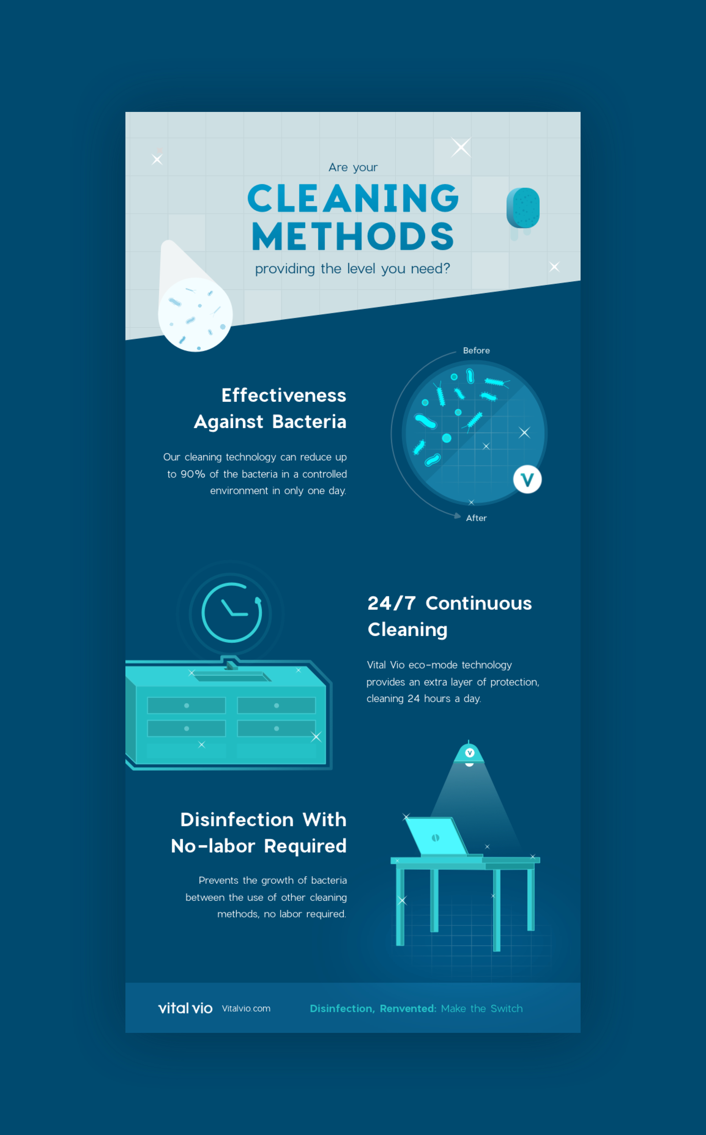
Web redesign was done; I created icons, Visuals, illustrations and also some collaterals designs like posters, brochure and more.